When you’re about to start a painting–whether you’re an amateur exploring new techniques or a pro refreshing your workflow–adding an initial toned layer called Imprimatura can make a big difference.
What is an Imprimatura?
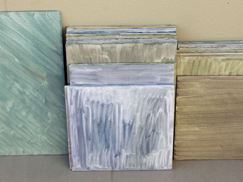
Imprimatura is an Italian term meaning “first paint layer.” It refers to a thin, transparent wash of color applied over the primed surface (canvas, wood panel, etc). Typically, it uses earth-colors like raw umber or burnt sienna diluted with solvent so you get a toned ground rather than full opaque paint.
Why bother? What does it give you?
- Value control from the start. The white of a canvas can trick your eye into making colors too light or bright. By starting with a mid-tone imprimatura you automatically work from a more realistic value range.
- Color harmony and depth. That under-tone subtly influences all layers on top, helping unify mood and making shadows or glazes richer.
- Reduced glare/distraction. A pure white ground can feel harsh and high-key. A toned ground is gentler and lets you focus on composition, form and value rather than being dazzled by white.
- Historical tradition + reliably stable process. Many old-master painters used it as standard in indirect painting approaches.
How do you apply it (in simple terms)?
- Choose a neutral or slightly warm earth tone (raw umber is a popular choice) and thin it with a solvent (turpentine or odorless mineral spirits) to make a transparent wash.
- Apply it evenly over your primed surface so the white still shows faintly through. You’re aiming for a stain, not a full opaque coat.
- Allow it to dry thoroughly before continuing with drawing, underpainting or compositions on top. Skipping or rushing this step can lead to issues.
- Consider the tone of your imprimatura in relation to the subject. A warm tone under a cool palette can enhance depth; a cooler tone under warm subject matter can balance it. For example: a reddish-brown imprimatura for greens/landscapes; or a cooler grey for a scene dominated by warm.
Things to watch out for
- Make sure the layer is thin and transparent; if it’s too thick you risk cracking or losing the benefits of seeing through it.
- Be mindful of that “fat over lean” rule if you’re working in oils. Your imprimatura should be relatively lean (less oil) compared to the layers above.
- Don’t feel you must use an imprimatura. Some painting styles skip it but if you want better control of mood, value and unity, it’s a very helpful tool.
Whether you’re prepping for a large studio work, teaching students the fundamentals, or just doing a side-study, using an imprimatura gives you a grounded starting point. It helps you see values more clearly, build depth from the get-go, and avoid the “struggling with white canvas” trap. Give it a try in your next piece. You might discover your workflow feels more confident, your mid-tones behave better, and your final layers hold together more harmoniously.

Leave a comment